
HOW MIGHT WE CREATE A BRAND IDENTITY THAT APPEALS TO YOUNGER CONSUMERS...
...WITHOUT SACRIFICING
WITH OLDER DEMOGRAPHICS?

The Montana Chamber Music Society, MCM, is a non-profit symphony that strives to promote the arts throughout Bozeman and Montana. They wanted to redesign their logo and brand identity to better resonate with younger consumers, while making sure that the brand remained recognizable to their largest consumer segment ( 45-65 year old consumers).
OUT WITH THE OLD


AND IN WITH THE NEW


THE LOGO

FOUR MAIN ASKS:
1) Include mountain imagery.
2) Include musical imagery.
3) Include the MCM monogram.
4) Bring a fresh, modern feel.

Original logo design.


MUSICAL INSPIRATION
I began by searching for musical symbols with organic forms that reminded me of mountains or a skyline. First, to satisfy their request for mountain imagery, but also to remain reminiscent of the original mountain logo.
INITIAL DESIGNS


I sketched initial concepts by hand, before bringing them over into Adobe Photoshop.
THE IMPORTANCE OF CLIENT FEEDBACK
I presented clients with three logo concepts, including alternate style choices for 2 of the designs.


THE FINAL DESIGN
After the clients selected a logo, I created a vectorized version of the logo with and without text on Adobe Illustrator. Ultimately, the clients chose the first design because it provided a sleek modern feel that would resonate with younger consumers, while remaining most reminiscent of the original MCM logo design. In this manner, it would resonate with existing MCM consumers and older demographics.
THE BRAND

THE COLOR PALETTE
MCM lacked a single palette across their website and socials, so I wanted to provide them with a set of 4 colors they could combine to create a sense of continuity and brand recognizability. They originally had a combination of red, yellow, blue, and maroon. However, I chose to utilize shades of yellow and blue to avoid being confused with University of Montana's Chamber Music - who utilize a combination of maroon and gold. I was also mindful of maintaining a high level of contrast for existing older consumer demographics.


FONT SELECTION
To maintain an old-school feel while reaching younger consumers, I chose a combination of serif and sans serif fonts. I decided to use Merriweather Bold for headers and Monserrat for body text, because a sans serif font is more legible on mobile devices younger consumers utilize. Additionally, I was careful to choose standard system fonts to increase ease for MCM staff, who are not comfortable with complicated digital processes.
MERCHANDISING MOCK-UPS
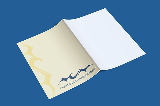
Finally, I created mock-ups to demonstrate how the new brand colors and logo designs could be utilized for merchandising.

